R - 각종 함수, 패키지 모음 (그때 그때 업데이트)


기본 함수들
엑셀 불러오기
library(readxl)
d <- read_excel('./data.xlsx')
난수 생성
sample(x=1:30, size=5, replace=T)
sample(1:5, 3, replace=T, prob=c(0.1, 0.1, 0.1, 0.1, 0.6))
rnorm(6, mean=10, sd=2)
runif(n=20, min=2, max=100)
rbinom(5, 10, 0.6)

set.seed(3)
sample(x=1:30, size=5, replace=T)
데이터프레임 생성
var1_obs1 <- runif(n=20, min=0, max=60)
var2_obs1 <- runif(n=20, min=0, max=60)
var1_obs2 <- runif(n=20, min=0, max=60)
var2_obs2 <- runif(n=20, min=0, max=60)

data_icc <- data.frame(var1_obs1, var2_obs1, var1_obs2, var2_obs2)
★데이터 재구성 요령★

위와 같은 데이터에서
각 joint와 long/short side를 구분하여, angle과 moment를 표현하고 싶다면
내가 "구분하려는" 데이터가 각각 column으로 존재해야 한다.
d3<-d %>%
  select(name, LLD, LLDr, hipAngleLong) %>%
  mutate(joint = 'hip', side = "Long", param = "Angle") %>%
  rename(c("hipAngleLong" = "value"))

d4 <-d %>%
  select(name, LLD, LLDr, hipAngleShort) %>%
  mutate(joint = 'hip', side = "Short", param = "Angle") %>%
  rename(c("hipAngleShort" = "value"))

....

d13<-d %>%
  select(name, LLD, LLDr, ankleMomentLong) %>%
  mutate(joint = 'ankle', side = "Long", param = "Moment") %>%
  rename(c("ankleMomentLong" = "value"))

d14 <-d %>%
  select(name, LLD, LLDr, ankleMomentShort) %>%
  mutate(joint = 'ankle', side = "Short", param = "Moment") %>%
  rename(c("ankleMomentShort" = "value"))


d15 <- rbind(d3, d4, d5, d6, d7, d8, d9, d10, d11, d12, d13, d14)
이와 같이 데이터를 재구성하면 된다.


이렇게 해야 이후 plotting할 때에도 간단해진다.
ggplot(d15) + geom_boxplot(aes(side, value)) + facet_grid(rows=vars(joint), cols=vars(param))
비록 y축 scale이 달라 잘 표현되지는 않지만, 그래도 만족스러운 결과를 얻을 수 있다.
scale이 다른 것은 각각 plotting하여 ggarrange 해보면,
f13 <- ggplot(d15[d15$param == "Angle", ]) + geom_boxplot(aes(side, value)) + facet_grid(rows=vars(joint))
f14 <- ggplot(d15[d15$param == "Moment", ]) + geom_boxplot(aes(side, value)) + facet_grid(rows=vars(joint))
ggarrange(f13, f14)
이와 같은 그림을 얻을 수 있다.
꼭 기억하자! 구분하려는 변수를 column으로!!
이런 방식도 가능하다. as.factor를 써주는게 중요했다.
f13 <- ggplot(d15[d15$param == "Angle", ]) +
  geom_boxplot(aes(as.factor(dx), value, col=side)) +
  facet_grid(cols=vars(joint)) +
  xlab('') + ylab('')  + ggtitle('Angle')

f14 <- ggplot(d15[d15$param == "Moment", ]) +
  geom_boxplot(aes(as.factor(dx), value, col=side)) +
  facet_grid(cols=vars(joint)) +
  xlab('') + ylab('')  + ggtitle('Moment')

ggarrange(f13, f14, common.legend = T, legend="bottom")
어떤 데이터를 어떤 데이터와 붙여서 표현할지, 등등은 aes를 잘 만져가면서 판단하면 된다!
Preprocessing (reshaping)
결측치 확인
which(is.na(politeness$frequency))
which(!complete.cases(politeness))
데이터 파악하기
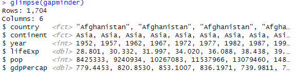
library(gapminder)
data(gapminder)

head(gapminder)
str(gapminder)
glimpse(gapminder)
summary(gapminder)

gapminder %>%
  group_by(continent) %>%
  summarise("mean of population" = mean(pop))


Wide to Long : Pivot_longer
library(tidyr)
library(dplyr)
library(gapminder) # for data

gapminder %>%
  select(-continent) %>%
  pivot_longer(!country, names_to = "name", values_to = "data")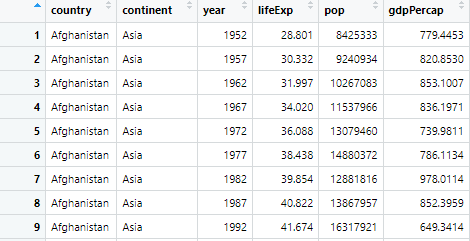

index를 column으로 변환하기 : rownames_to_column
library(tibble)
data(USArrests)
Arrests <- rownames_to_column(USArrests, "State")

# 반대의 경우
Arrests2 <- column_to_rownames(Arrests, "State")

통계 검정
Wilcoxon signed rank test for paired data
with(sono_mean,
     wilcox.test(ird_mean[visit=='visit1' & location=='up' & position=='rest'],
                 ird_mean[visit=='visit2' & location=='up' & position=='rest'], paired=T), exact=FALSE)

with(sono_mean,
     wilcox.test(ird_mean[visit=='visit1' & location=='up' & position=='rest']-
                 ird_mean[visit=='visit2' & location=='up' & position=='rest'], mu = 0))

with(sono_mean,
     wilcox.test(ird_mean[visit=='visit1' & location=='up' & position=='rest'],
                 ird_mean[visit=='visit2' & location=='up' & position=='rest']))
맨 위는 쉼표로 두 데이터를 연결하고 paired option True
두번째는 - (빼기) 로 하고 mu=0과 비교
세번째는 단순히 쉼표로 연결
첫번째, 두번째가 맞다!
항상 Documentation을 잘 확인하자..
https://www.rdocumentation.org/packages/stats/versions/3.6.2/topics/wilcox.test
wilcox.test function - RDocumentation
wilcox.test(x, …) # S3 method for default wilcox.test(x, y = NULL, alternative = c("two.sided", "less", "greater"), mu = 0, paired = FALSE, exact = NULL, correct = TRUE, conf.int = FALSE, conf.level = 0.95, …) # S3 method for formula wilcox.test(formul
www.rdocumentation.org
★ group_by, summarise의 강력함 ★
for 문을 이용하여
for(i in c('up', 'low')){
  for(j in c('head up', 'rest')){
    print(i)
    print(j)
    wtst <- with(sono_mean,
                 wilcox.test(swe_mean[visit=='visit2' & location==i & position==j],
                             swe_mean[visit=='visit1' & location==i & position==j], paired=T, conf.int = T))
    print(wtst)
  }
}
이런식으로 돌려서 나온 결과를 하나 하나 적어가며 표에 정리했는데,
group_by, summarise 조합을 이용하면 이럴 필요가 없다..
sono_mean %>%
  group_by(location, position) %>%
  summarise(p.value = wilcox.test(
    ird_mean[visit == 'visit2'] - ird_mean[visit=='visit1'])$p.value
  )
이거 한방이면

이렇게 결과를 보여준다..
★ group_by, summarise의 강력함 2★
t_test_results <- d %>%
  summarise(across(hipAngleLong:ankleMomentShort, ~ t.test(.[SLDx. == 0], .[SLDx. == 1])$p.value))
print(t_test_results)
위처럼 하면 하나의 dataset에서 SLDx.가 0인 그룹과 1인 그룹의
특정 컬럼들을 모두 t.test하여 비교할 수 있다.

Plot 관련 함수들
point plot
library(ggplot2)
ggplot(gapminder) +
  geom_point(aes(x=gdpPercap, y=lifeExp, color=continent, size=pop)) +
  scale_x_log10()
facet_wrap
library(ggplot2)
ggplot(gapminder) +
  geom_point(aes(x=gdpPercap, y=lifeExp, color=continent, size=pop)) +
  scale_x_log10() +
  facet_wrap(vars(year))
Paired boxplot
d %>%
  select(name, stepLengthLong, stepLengthShort) %>%
  pivot_longer(cols=-name, names_to = "side", values_to = "data") %>%
  ggplot() + geom_boxplot(aes(side, data)) +
  geom_jitter(aes(side, data), width = 0, height=0) +
  geom_line(aes(side, data, group=name), color="grey") +
  labs(x="", y="") + scale_x_discrete(labels=c("Long", "Short"))
plot 편하게 개요잡기 : Esquisse
library(esquisse)
data(gapminder)
esquisser()
ROC curve 그리기
library(tidyverse)
library(pROC)

d1 <- d %>% select(name, LLD, LLDr, stepLengthLong, stepLengthShort) %>%
  mutate(dxBySL = ifelse(stepLengthLong > stepLengthShort, 1, 0))

r1 = roc(d1$dxBySL, d1$LLD, levels=c(1, 0), direction=">")
plot.roc(r1, print.auc = TRUE, print.thres = TRUE)
ggplot에 통계치, significance 등 추가하는 ggsignif 라이브러리
library(ggsignif)

data_subgroup %>%
  select(weight, ird_before, ird_after) %>%
  pivot_longer(cols = !c(no, name, weight),'time', 'value') %>%
  mutate(weight_ = ifelse(weight > 63.03, 'heavy', 'light')) %>%
  ungroup() %>%
  select(time, value, weight_) %>%
  ggplot() +
  geom_boxplot(aes(x=time, y=value)) +
  geom_signif(aes(x=time, y=value),
              comparisons = list(
                c("ird_after", "ird_before")),
              test='wilcox.test',
              test.arg=list(paired=T, exact=F)) +
  scale_x_discrete(limits=c("ird_before", "ird_after")) +
  facet_wrap(vars(weight_))
이런식으로 ggplot에 통계치 비교를 해서 그려준다.
파이프라인 내에서 하느라 mapping(aes)에 뭔가 문제가 생겨서
aes() 생략하고 했더니 계속 오류가 났었고,
paired test를 해야 하는데 안되어서 자꾸 p value가 이상하게 나와서 애먹었다. 이는 test.arg를 사용하여 해결하였다.
기타 필요한 것들
ICC
library(irr)

data_icc %>%
  select(var1_obs1, var1_obs2) %>%
  icc(model="twoway", type="agreement")
'Career > R' 카테고리의 다른 글
| ICC(intraclass correlation) 구하기 (0) | 2023.05.10 |
|---|---|
| Network meta-analysis (0) | 2023.01.06 |
| ggplot2 #4. practice - moonBook::acs (0) | 2023.01.03 |
| ggplot2 #3. Useful libraries - GGally, ggpubr, gganimate, esquisse, color packages (0) | 2023.01.02 |
| ggplot2 #2. 추가 요소들 (0) | 2023.01.01 |